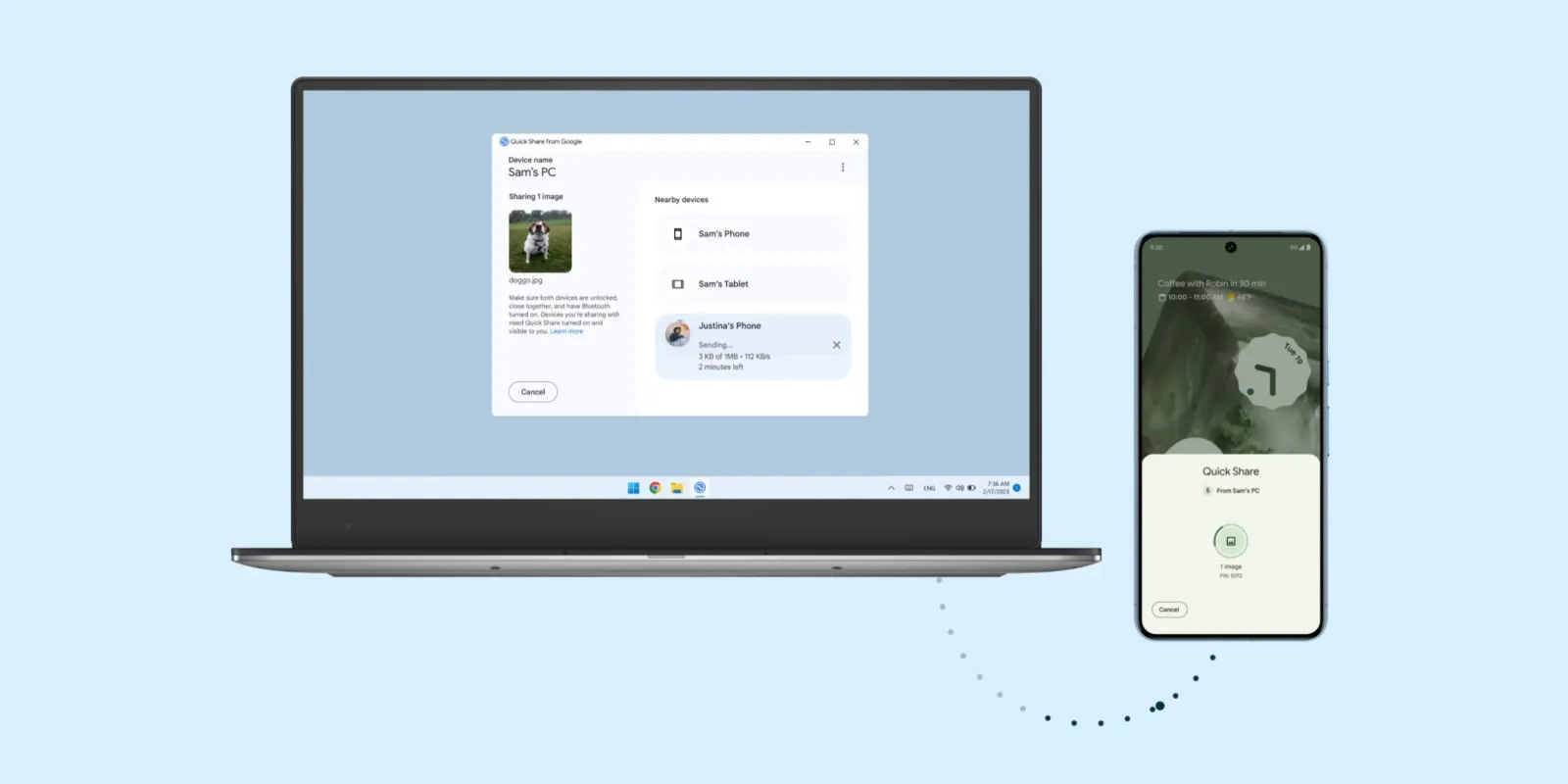
Google is rolling out a new full-screen user interface (UI) for Quick Share on non-Samsung Android devices, standardizing the experience and making file transfers much more intuitive across the ecosystem.

Table of Contents
ToggleA Clearer, Full-Screen Experience
The new design, which first appeared in beta on Samsung devices running One UI, replaces the old pop-up menu with a much clearer, full-screen interface. This move is part of a wider effort to standardize the file-sharing experience following the merger of Nearby Share and Samsung’s Quick Share into a single platform in 2024.
What’s New in the Quick Share UI?
Simplified Sending and Receiving
The most significant change is the addition of dedicated tabs for sending and receiving files. The new interface defaults to the “Receive” screen, which prominently displays your device’s name and is where incoming file requests will appear. This is a big improvement over the previous design, which defaulted to a settings page.
The redesigned “Send” tab now includes a built-in file picker, allowing users to select and preview multiple files of various types before sharing. This integrated functionality removes the need to use a separate file manager to initiate a share, streamlining the entire process.
The Bigger Picture: A Unified Ecosystem
By aligning the Quick Share experience for non-Samsung Android devices with the new UI on Galaxy phones, Google is working to unify file sharing across its ecosystem. This update ensures that whether you’re using a Pixel, a Samsung, or any other Android phone, the process of sharing files will be fast, seamless, and consistent. This also extends to the desktop experience, where users can optimize their setup to automatically hide the taskbar in Windows 11 for a cleaner workspace. While some devices are already receiving the update, the rollout is gradual and may not be immediately available to all users.


